SAGAN EDITIONS

TOABF: June 15 - 18

Sagan MacIsaacComment

SAGAN EDITIONS is please to be participating in Toronto Art Book Fair again this year! TOABF is a free public event taking place June 15 - 18 at Artscape Youngplace (180 Shaw St, Toronto). We will be joining 80 Canadian and international exhibitors at the fair and will launch new artist editions to celebrate - stay tuned for more info!
 

Opening Party: Thursday, June 15th 6-10pm

Fair Hours:

Friday, June 16th 12-8pm

Saturday, June 17th 12-8pm

Sunday, June 18th 12-6pm

https://www.torontoartbookfair.com/ 


Publication Launch: see what happens

Sagan MacIsaacComment

Join us for the launch of the 'see what happens' exhibition catalogue. For one night only, we're remounting the works:

'Practicing Ohr' by Naomi Yasui
'Blinds' by Darby Milbrath
'a lot' by Laura McCoy

*~ Refreshments ~*
**~ Artists in Attendance~**

December 14th, 7-9pm
Xpace Cultural Centre

Contributors:
Curator: Sagan MacIsaac
Publication Designer: Layne Hinton
Essay: Arielle Gavin
Artists: Laura McCoy, Darby Milbrath, Naomi Yasui
Photographer: Yuula Benivolski
Published by: SAGAN EDITIONS 

Thank you:

Public Studio team: Elle Flanders, Tamira Sawatzky, Lili Huston-Herterich
Xpace Cultural Centre team: Emily Gove, Cameron Lee, Geneviève Wallen

Cover image ‘Practicing Ohr’ by Naomi Yasui.

This project was generously supported by the Ontario Arts Council.

Holiday Pop-Up Party: Sagan Editions + Flying Books, Dec 1st

Sagan MacIsaacComment

COME TO OUR HOLIDAY POP-UP PARTY!


Sagan Editions & Flying Books invite you to celebrate our inaugural pop-up, "Staff Picks," on Thursday, December 1st, from 6 to 8 PM, at Likely General, 389 Roncesvalles Ave.

Sagan Editions artists have teamed up with Flying Books to select books that inspire them. Their picks will be available for sale alongside their editions at Likely General from November 28 to December 20.
 

Available artist prints and editions by:

Hannah Enkel, Heather Goodchild, Layne Hinton, Mani Mazinani, Darby Milbrath, Alicia Nauta, Lido Pimienta, Danielle Suppa, Margaux Williamson, and Naomi Yasui.

* COME TO THE PARTY *
Thursday, December 1, 6:00 - 8:00 PM
~ Refreshments ~

SHOP THE POP-UP
Books and editions available for sale
Monday, November 28 to Monday, December 20

WHERE
Likely General
389 Roncesvalles Ave., Toronto

SAGAN EDITIONS at Edition Toronto

Sagan MacIsaacComment

We are pleased to announce that Sagan Editions will be at Edition - Toronto's Art Book Fair! Visit us from October 28-31st, 2016. All of the editions will be available, including a few new ones launching at the fair. Admission is free. See you there!

More info on Edition here: http://www.editiontoronto.com/


NEWS: Sagan Editions at Toronto Art Book Fair, June 16-19

Sagan MacIsaacComment

TORONTO ART BOOK FAIR TOABF 2016 | JUNE 16 - 19


Sagan Editions is so pleased to be participating in The Toronto Art Book Fair this weekend! Come visit us at table 8.108 - all of the editions will be available.  

The Toronto Art Book Fair (TOABF) is a free public event taking place Thursday, June 16th - Sunday, June 19th at Artscape Youngplace (180 Shaw St. Toronto, ON) featuring curated exhibitions, 75 Canadian and international vendors, and community programming that includes a speaker series, readings, talks, launches and workshops.

In its inaugural year TOABF will highlight over 150 national and international artists, publishers, designers, curators, bookmakers, writers, and performers. TOABF is dedicated to increasing the visibility, dissemination, appreciation, and understanding of the artist’s book and its contemporary expression in print culture and visual arts. Independent artistic print culture has a rich narrative in Canadian art history, and is an often overlooked aspect of Canadian cultural identity. The goal of TOABF is to highlight these personal and collective stories, elevate the artistic integrity of artists’ books, multiples, and printed matter by presenting Canadian and international artists to a wide audience.

Funded by: Ontario Arts Council and Toronto Arts Council Program Partners: 8Eleven, Art Metropole, C Magazine, Museum of Contemporary Art Toronto Canada, PaperHouse Studio, SKETCH, Colour Code, Blackflash Magazine, Nothing Else Press and Typology Projects

OPENING LAUNCH PARTY: Thursday, June 16th 6-9pm

FAIR HOURS: Friday, June 17th 11-7pm Saturday, June 18th 11-7pm Sunday, June 19th 11-6pm

2016 VENDORS: Akin Collective 8Eleven Alicia’s Klassic Kool Shoppe Anchorless Press B&D Press Badlands Unlimited BlackFlash Booger Brie C Magazine Cabinet Magazine Carbon Paper Colour Code CRIT Paper DNA Artspace Double Dot Magazine Draw Down Books Ediciones Daga Eli Howey Endless Editions Fangrrlz Femme Crimes Distro Fillip Food Court GuyGuyGuy Halifax Ink Hesse Press Hex Editions Impulse (b:) Issue Press Jackie Lee Art Jonathan Rotsztain Justseeds Artists’ Cooperative Kendra Yee Lido Pimienta Lise Haller Baggesen Louise Reimer Illustrations Makuktu Art Project Massive Goods Matte Magazine Matthew Scott Gualco Micah Lexier Milkweed Zine Mother Books Musterni New Documents Nothing Else Press Open Sesame Or Gallery and Bookstore Paul and Wendy Projects Perish Publishing Phil Woollam Possible Worlds Prefix Photo Magazine Project Space/ Vancouver Art Book Fair Ray Ray Sab Meynert Sagan Editions Sarahaha School of Image Arts - Ryerson Scrapbooks Sergej Vutuc Slow Editions Soon.tw Space Face Books Studio-Set Swimmers Group Tallulah Fontaine Technologie und das Unheimliche The Canadian Academy in Rome TXTbooks Typology Projects University of Toronto Art Galleries Vice Versa Press YYZ Artists’ Outlet And more…

Feature: Alicia Nauta

Sagan MacIsaacComment

Alicia Nauta's Felted Dust + Behind Blinds

Alicia Nauta, Felted Dust, SAGAN EDITIONS Silkscreen 2016


When did you begin silkscreening? Why were you attracted to the medium?

I was floundering about at OCAD not knowing why I was painting. I saw amazing screenprinted show posters by Jesjit Gill and other artists around Toronto. I was going to zine fairs and seeing printed books. People were always in the print studios which attracted me because I was shy and a bit lonely in art school. I switched my major to printmaking without having taken a class. I found screenprinting to be the most accessible and captivating of the printmaking mediums. The process was quick and satisfying, and felt more relevant in terms of practical application after school. You can screenprint garments, wallpaper, posters, art prints, books, tote bags, tape and album covers, fabric, flyers...so many different applications. I love the flattened graphic quality, the way the layers of ink interact, gradients that create an illusion of depth and the velvety matte appearance of its printed surface.


You’ve told me that your work process begins with making collages and then you later turn them into silkscreens. Where does your source material for the collages come from?

All my source material comes from thrift stores. Thrift stores are my sad museums that also inspire me. There's all this stuff from people's lives jumbled up together. The crappy, the useless, the sentimental, it's all on one shelf. The books I look for are often DIY home decor guides from the 60's and 70's (like wall and window treatments), patterns for quilts and crocheting, botanical guides and encyclopedias, pre-computer graphic design and open source manuals, clip art resource books for teachers...etc.


Psychedelic interior and exterior spaces are often portrayed in your prints - what themes are you exploring?

Environmental degradation from the human hand, civilization crumbling, abstracted reality, perspective and common laws of physics gone amiss (darkness from a lamp's light for example), considerations of domestic space and belonging, wonder that we live on a planet that is so strange and beautiful and diverse. Also, because I'm working in collage all my images are sourced from different books and therefore are often on contrasting dimensional planes; a 2d object next to a 3d object...there are usually multiple perspectives, or shadows going opposite ways as a result. I think it makes for compositions that at first look familiar but start to feel strange or alienating after looking longer.

I don't work on a computer, everything is sourced from books, then photocopied, cut and pasted and screenprinted. The manipulations I make to the original images are all on a photocopier. I think as a result the compositions have a particular look that also reflects where I'm sourcing the images. I want them to look as if they are simultaneously from the past and the future. I guess I'm referencing the notion of timelessness? I think about the layers of compacted history found in the ground, like using images of Roman architecture next to an image of a crocheted hanging plant, thousand of years apart, yet in the timeline of planet earth, right next to each other. Humans have been on this planet such a short time compared to everything else (like plants) so you can imagine everything all mashed up together...picture the remains of civilization floating around as cosmic garbage.


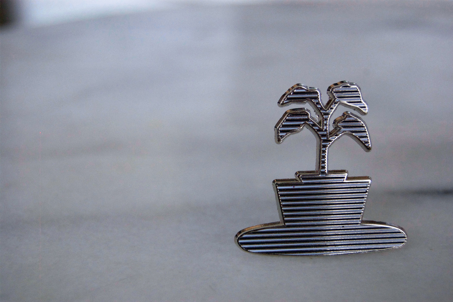
Tell me about the enamel lapel pin you created for Sagan Editions:

It was plucked out of a collage I made of a room, a strange interior. I was messing around with cutting out plants in containers and looked at the negative space surrounding what I had just cut out. The simple outline was more striking than the image I cut out. I put a line pattern behind it and there it was. It's a houseplant. It's a reminder of nature in a domestic space. Plants give us oxygen, they give us life. It's a comforting image, but the line pattern complicates it a bit. I think it's like looking through blinds into a room with dusty plants.

Alicia Nauta, Behind Blinds, SAGAN EDITIONS enamel pin 2016 

Alicia Nauta, Behind Blinds, SAGAN EDITIONS enamel pin 2016 


What’s inspiring you right now?

I read this article a while ago about a woman who makes sea silk. I'm still thinking about it. Particularly this part:

'After that, at sunset, I go with her to a deserted cove where she prays twice a day. "You have to be respectful to the place you live in. You are just passing by, these places are here to stay. And the sea has its own soul and you have to ask for permission to get a piece of it," she says.'


Alicia Nauta graduated from OCAD University with a BFA in Printmaking. All her work is part of Alicia’s Klassic Kool Shoppe: collage, screenprinting, installation, wallpaper, bookworks, and a growing collection of found oddities for a future museum. She is member of Punchclock, a Toronto print studio, and has taught screenprinting and other DIY workshops at the Art Gallery of Ontario as part of the AGO Youth Free After Three program. She regularly tables at the NY and LA Art Book fairs with publications and prints. Her work has been exhibited at the AGO, Printed Matter, Katherine Mulherin, Artscape Youngplace, Art Metropole, and Narwhal Projects, as well as permanent wallpaper installations at Double Double Land, Likely General and a really cool baby's room.

Shop Alicia's print and pin here.

Feature: Hannah Enkel

Sagan MacIsaacComment

HANNAH ENKEL'S 'THE WORLDS TOTE'

Hannah Enkel 'The Worlds Tote' SAGAN EDITIONS 2016. Hand dyed, silkscreened 100% cotton tote bag. Edition size: 12.

Hannah Enkel 'The Worlds Tote' SAGAN EDITIONS 2016. Hand dyed, silkscreened 100% cotton tote bag. Edition size: 12.

You’ve played with the idea of an ‘inspirational quote’ for this edition. Tell me more.

I created an anti-inspirational tote to give a utilitarian object the weight of a world. Inspirational quotes are deeply entrenched in pop-visual culture - we see them everyday on Instagram, t-shirts, mugs, etc. They can sometimes be anxiety inducing, or triggering, like, ‘why can’t I get to the place of being productive, strong, and be a carefree person that these quotes so simply demand of me?’

Tote bags are with us to run mundane errands, to fill up with things written on our everyday lists. With depression, these tasks can feel insurmountable. Suddenly a grocery list, added to a list of bills and a trip to the pharmacy can feel like too much. Making lists is one way I cope with that feeling.  I make lists of things I am not doing that I should be, I make lists of my flaws, mistakes I’ve made…I make lists of all of the ways I impact the destruction of the planet earth. These considerations become an entire world when they are my focus. I cross them off to simultaneously accept and reject their power.

How did you create the bag?

I dip dyed the bags so that the majority would be an ink field resembling a consuming, inky ocean. The text is silk screened onto the bag using a colour that matches the deep hue. I wanted a tone-on-tone look. The poem is a piece of writing that combines small tasks, big goals, my body, my environment, and my responsibilities.

Why did you use the format of a list for this poem?

Lists can be so helpful. They are practical and help you make sure you get everything you need done. I also feel they are very cathartic. I always feel relieved to cross off a task.


Shop Hannah's edition here.

Feature: Danielle Suppa

Sagan MacIsaacComment

Danielle Suppa's 'Poolside'

Danielle Suppa 'Poolside' SAGAN EDITIONS 2016

Danielle Suppa 'Poolside' SAGAN EDITIONS 2016

Your Sagan Editions print features a beautiful grid of terrazzo - composite material, poured in place or precast, which is used for floor and wall treatments. Where did your love affair with terrazzo begin?

I think a lot of my work stems one way or another from childhood, daily experiences and cultural influences; my love of terrazzo definitely draws from all of those sources. My eyes have always been drawn to any sort of pattern and I've always loved terrazzo floors since I was a kid, especially when you consider that they are found in so many commercial places like schools, banks, the subway, etc. I like to reimagine the patterns that we encounter in our daily lives that we don't really even think twice about and make something beautiful and graphic out of them. I've always been fascinated by that fine line between natural and man made materials and I try to delve into that in my design work. I've also always loved classic Italian design and I think terrazzo is such a timeless material.

Do you have a design mantra? What is it?

Be thoughtful, be playful, be a sponge. I also 100% believe that good design is in the details.

You have a history of working in fashion design, which I can see in your print - the pattern you’ve made could easily be a textile design. How does this history inform your visual sensibility and current design work?

Actually this print was originally developed as a textile pattern during my studies at Central St. Martins in 2014. Initially I thought it would look great on a pillow or towel - something with defined edges to highlight the overall grid layout. My design brain always wants to place patterns on objects or surfaces so it's really exciting to see this one as an art print. Ironically terrazzo has had a bit of a fashion moment lately with many influential lines such as Acne and Maison Kitsune featuring the print heavily in their collections and shop displays the past few seasons. I'm always fascinated by that unintentional, collective thinking that often happens in fashion. I am also slightly obsessed with symmetry and geometric forms which is found in a lot of my work, even though I try to push myself to make things a bit more loose these days.

What’s the best part about being the owner of SOUVENIR Studios (studio, space, shop in Toronto, ON)?

SOUVENIR has by far been the most rewarding experience of my life as a designer thus far. I've had the opportunity to make meaningful creative and personal connections and so many delightful people have walked through the door (including one Sagan MacIsaac!)- and it's only been 6 months. There's so much more in store. It gives me great joy to be able to support other fellow designers and artists and give their ideas a home. SOUVENIR is a place where I hope that anything can happen - I like to think of it as a design playground and I think this city needs more beautiful, welcoming places like that.

What’s your favourite piece of art in your home?

Ah, such a hard question! Every piece is so special in its own way. I'd have to say one of my favourite is a pieces from Graham Roumieu called "I Choreographed A New Dance For You" (2013) just because it is so wildly joyful. We live in a loft with lots of open space and we've put it up in a section of our place that we lovingly refer to as 'The Dance Floor'. My other favourites are two risograph prints I bought during my travels in Amsterdam from Sigrid Colon, because they are so beautiful and remind me of a particularly magical day there.

Shop Danielle's SAGAN EDITIONS print 'Poolside' here

NEWS: SAGAN EDITIONS Spring Update + Launch Party

Sagan MacIsaacComment

Pictured: 'Women in the Woods' by Darby Milbrath in our Aluminium frame.

SAGAN EDITIONS X Art Metropole

Pictured: 'Waterways' by Heather Goodchild, 'Vase No.7' by Naomi Yasui, '(en)meshes' by Layne Hinton.

We are so pleased to announce our current roster of SE prints are now available at Art Metropole in Toronto. Art Metropole is a not-for-profit organisation with a focus on the production, dissemination and contextualisation of artist-initiated publication in any media, especially those formats and practices predisposed to sharing and circulation. The Art Metropole Collection is also available online and to the public at the National Gallery of Canada Library as well as on the Archive maintained on their site. Art Metropole was founded in 1974 by the artists' collective General Idea as an artist-run centre. 


SAGAN EDITIONS X SOUVENIR

SOUVENIR Studios, Toronto


SOUVENIR welcomes a month long feature of Sagan Editions and hosts the debut of 5 new editions alongside the entire roster of works by Heather Goodchild, Layne Hinton, Darby Milbrath, Margaux Williamson and Naomi Yasui. 

Spring Releases Launch Party
May 6, 2016 | 6-10pm

SOUVENIR

shop | studio | space

1232 College Street West (just east of Lansdowne Avenue)

Toronto | M6H 4C1

New Sagan Editions prints and multiples by:

Alicia Nauta

Lido Pimienta

Hannah Enkel

Danielle Suppa / SOUVENIR Studios

For more details on Sagan Editions email info@saganeditions.com

Follow us @saganeditions

Feature: Layne Hinton

Sagan MacIsaacComment

Layne Hinton's (en)meshes 

Layne Hinton, (en)meshes, 2015

Layne Hinton, (en)meshes, 2015

Layne Hinton is a true multi-disciplinary artist. Through installation, film/video, performance, sculpture, printmaking and collage, Hinton examines space, light, and form. Her architectural, texture-heavy Sagan Editions print (en)meshes reflects her ability to easily translate sculptural 3D forms with wire to a screen print and subsequent digital work. Her experimentation with mediums collides into a layered collage that's rich in depth, both in perspective and tone. 

Layne made this awesome visual-mapping of her process to give us a behind the scenes look at the making of (en)meshes:


Want to learn more about Layne's practice? Check out my conversation with her for AkimboTV here. 

-Sagan MacIsaac 

Feature: Heather Goodchild

Sagan MacIsaacComment

Heather Goodchild's Waterways

Heather Goodchild Waterways 2015

Heather Goodchild Waterways 2015

 'Waterways' is part of a group of collages that Heather made into banners, which were installed at Fort York, Toronto in Spring 2015. When I saw them, strung from trees and across a bridge, their graphic patterns and festive colours struck me. They evoked Heather’s sensibilities (I was reminded of her quilts, textile techniques, and tapestry installations) but they had a sense of celebration that I hadn’t noticed before in her work. I immediately knew I’d like to feature one as a print for Sagan Editions. I chose 'Waterways' because of the way she has experimented with paper, and how it takes on qualities of fabric with its pattern play.

- Sagan MacIsaac


SM: A lot of your work, like your hand-hooked rugs or installations, is known to be very labour intensive, time consuming and tedious. Did your process change when you were making collages? Was a sense of immediacy present?

HG:  Yes, the process was more like the planning phase for a rug or quilt.  It was a new experience for me to send off scans of the collages to be digitally printed into large banners rather than spending hours silkscreening on my floor.  I enjoyed seeing the texture of the paper printed large scale onto the fabric.

SM: What was some of the inspiration behind Waterways?   

HG: The whole installation was meant to have a medieval fair meets depression era jazz club feeling.  This particular collage was also inspired by a pattern on a Liberty of London scarf from the 70's.

SM: Have you been using paper more frequently in your practice? Is this something we’ll see more of?

HG:  Yes, I've been taking a break from textiles and have been really into drawing and painting - ostensibly to improve my skills in making the textile pieces but it will be hard to go back to the slow process of rug hooking after the more immediate outcomes of paper.

SM: Is there a piece of art in your home that you couldn’t live without?

HG: I'm particularly fond of a painting I found in Germany from 1918 of a mountain scene.  It's very bleak with telegraph poles but features a path that curves behind a hill.  You can kind of get lost following the path around the corner.  Sometimes I like to think that the artist was returning home from the war.